

White walls and clean edges have shaped high-end homes here for more than ten years, borrowing from sleek European displays. Yet lately, some people in South Africa are asking if such pale, bare rooms truly belong on this land. Sunshine beats down hard under wide skies, while vibrant patterns pulse through daily life.
Sharp minimalism feels out of step for certain households. Culture runs deep in color, texture, rhythm – not silence. So the question grows: does cold simplicity still match how we live? Not every space needs to erase itself to feel expensive. Light bounces differently near the equator. Homes breathe better when they reflect who lives inside them.
A fresh look emerged – warm minimalism – that keeps modern design alive through touchable textures, natural warmth, and handmade details, because it values where things belong. This version of simplicity tries for a home with feeling, since cold or distant rooms miss the point.
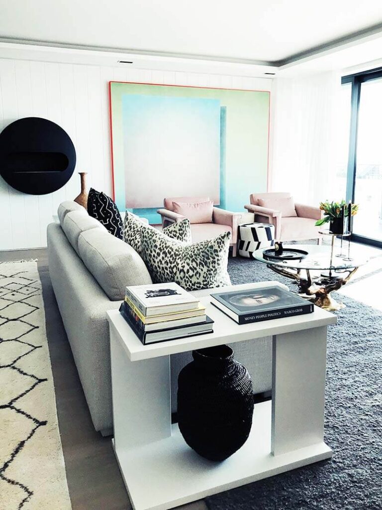
Why is the trend of white-box fading in popularity?
When it comes to a traditional minimalist interior, the following are generally the most common elements:
- Stark white walls
- Cool gray finishes
- Glossy surfaces
- Minimal texture
- Uniform materials
They are visually clean, but perhaps may not feel like South Africa’s environment. Cool tones are often intensified by the country’s intense natural light, creating a harsher atmosphere in the home during midday/afternoon.
Also, spaces with a minimalist aesthetic can appear fleeting and trendy. Homeowners are looking to have interiors that will age well and have some personality to them—no longer like a luxury hotel lobby.
Designing for South African Light
Sunlight shapes warm minimalism more than almost anything else. A room feels different when daylight fills it slowly. This style leans on soft brightness during mornings, especially. Light travels across surfaces in ways that matter deeply here. Shadows stretch gently by midday, adding depth without effort. The quality changes again near dusk, bringing warmth back into corners.
Out here, sunlight hits harder – brighter, hotter, yellower than back home in Northern Europe. Instead of fighting that reality, light-filled, simple spaces go with it.
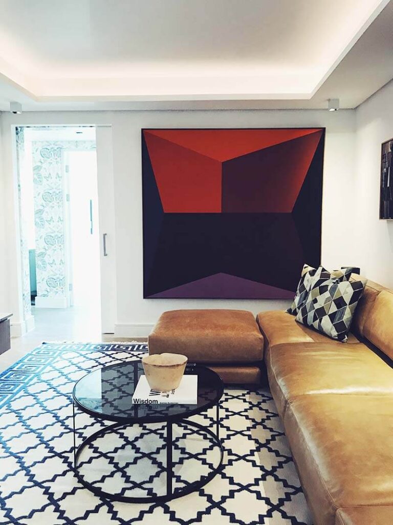
You can also use some of the following to create a less plain look than white:
- Earthy clay tones
- Warm limestone shades
- Rich ochres
- Desert sand neutrals
- Muted terracotta
The interior is transformed beautifully depending on the sun’s course throughout the house.
The new appearance of organic silhouettes
One of the other big changes is the departure from rigid geometric furniture.
Warm minimalism includes the muslin and the less angular:
- Curved sofas
- Rounded coffee tables
- Organic dining chairs
- Sculptural lighting
- Low-profile seating
Bouclé upholstery is still worn and is frequently combined with natural fibers, linen, and fabric that have a tactile feel for depth and comfort. The softer forms help to contrast with the typical elements of contemporary South African architecture.
Use of Natural and Local Materials
Wood has become one of the most significant aspects of providing warmth.
Designers are now opting for more natural, multi-layered finishes that reveal the material’s texture.
Popular choices include:
- Spruce sourced responsibly in the local area.
- Dark pod mahogany
- Oak – grain visible
- Reclaimed timber accents
Texture comes through in subtle ways here, yet never takes center stage. A quiet presence defines how each element feels within the space.
Wabi-Sabi and the Beauty of Imperfection
Warmth meets simplicity in South Africa, where design leans into Japan’s Wabi-Sabi spirit. Imperfection finds honor here, quietly shaping spaces with honesty. Instead of chasing flawlessness, surfaces show age like stories.
Materials breathe naturally, their roughness left untouched. Light plays softly across uneven walls. Time feels present, not hidden behind polish. Even cracks gain meaning under this quiet lens.
This philosophy is reflected in:
- Handmade ceramics
- Textured plaster walls
- Natural stone finishes
- Handwoven textiles
- Imperfect artisanal décor
Textured plaster is a very common choice that blends in marvelously with robust afternoon light. Walls have depth and character as the shadows play on them, which flat painted surfaces can’t create.
These subtle flaws give the homes a sense of livability and intimacy.
Stick to Bold Colors in Selected Areas
Out of nowhere, deep gem-like hues show up on walls, shifting the feel of just one area. Instead of painting everything bold, creators pick spots that whisper intensity. A sudden splash of emerald or sapphire changes how light moves through a corner.
These rich tones settle into corners where calm already lives, offering depth without shouting. One wall, maybe a ceiling, catches the eye differently. Color acts like a quiet guest, present but never overwhelming. Mood shifts happen slowly here, not all at once.
Popular choices include:
- Deep safari greens
- Rich teals
- Burnt aubergine tones
- Earthy charcoal blues
- Dark olive hues
This would be ideal for dining areas, libraries, studies, and wine rooms. The outcome is an elegant getaway that pairs up with the more neutral and muted spaces of the house.
Follow These Tips:
If you want to keep this design trend, here are some of the main principles to keep in mind:
- Keep decoration to a minimum; focus on texture.
- Avoid using bright whites.
- Use natural materials as much as possible.
- Buy fewer but better-quality furniture.
- Buy local craft products and handicrafts.
- Leave the flaws as a part of the design narrative.
Skip the crazy color use, but use bold colors strategically.
What is The Future of Luxury Living?
Out here, warm minimalism isn’t chasing trends – it grew from wanting things to feel real. As folks lean into the one-of-a-kind vibe of southern South Africa, spaces take on a quieter rhythm. Light shifts differently across walls. Local textures show up in wood, stone, and fabric. Rooms start telling stories shaped by place, not pictures.
Warm minimalism isn’t a lack of, but a better way of thinking, living, and making spaces that are more intentional and have more soul.
FAQ
What is a warm minimalism interior design?
Soft light fills rooms shaped by clean lines, yet touched by wood grain and woven fibers. Instead of sharp edges, there’s a quiet warmth underfoot, in walls, along corners. Neutral tones appear – clay, sand, moss – but never feel empty. These places breathe, hold traces of use, and show rest without stiffness. Smooth surfaces meet rough ones, balance forms without shouting order.
What makes these designs suited for South African luxury homes?
Out here, sunlight shapes how spaces come alive – warm beiges gain depth, rough surfaces catch glimmers. Because the air feels close to the ground, raw timber and stone fit just right. Instead of fighting the heat, rooms breathe with it, using clay plasters that shift shade through the day. Handmade pots, woven fibers – they sit easy under wide eaves where dust dances in beams. Light does not glare; it settles, softening edges like time on rock.
How to use warmth in a minimalist interior design?
Start with grainy wood beside soft linen, then add a nubby bouclé pillow. A rough-hewn stone sits near hand-thrown ceramic, each piece chosen slow and careful. Fewer things, yes – yet richer ones. Warm ochre meets dusty terracotta, blending like sunset through cotton curtains. Natural fibers pile lightly, building texture that breathes. Simplicity stays intact because clutter never enters. Depth grows quiet, under the surface.
What colors will work best for a warm minimalist SA aesthetic?
Some folks lean toward muddy browns, sunbaked yellows, pale beiges, burnt oranges, and soft warm grays. To shift things up, areas like reading nooks or dinner corners might bring in rich hues – think forest swim, duck-pond blue, or shadowed leaf.